
Relative Performance Rotation Graph
Where sectors and stocks are rotating.
How to read this →Coming soon
One picture instead of thirty charts: every sector index plotted by how strong it is against Nifty 50 and whether that strength is rising or fading. The tail is the last ten sessions, so you see the direction of travel, not just where something sits today.
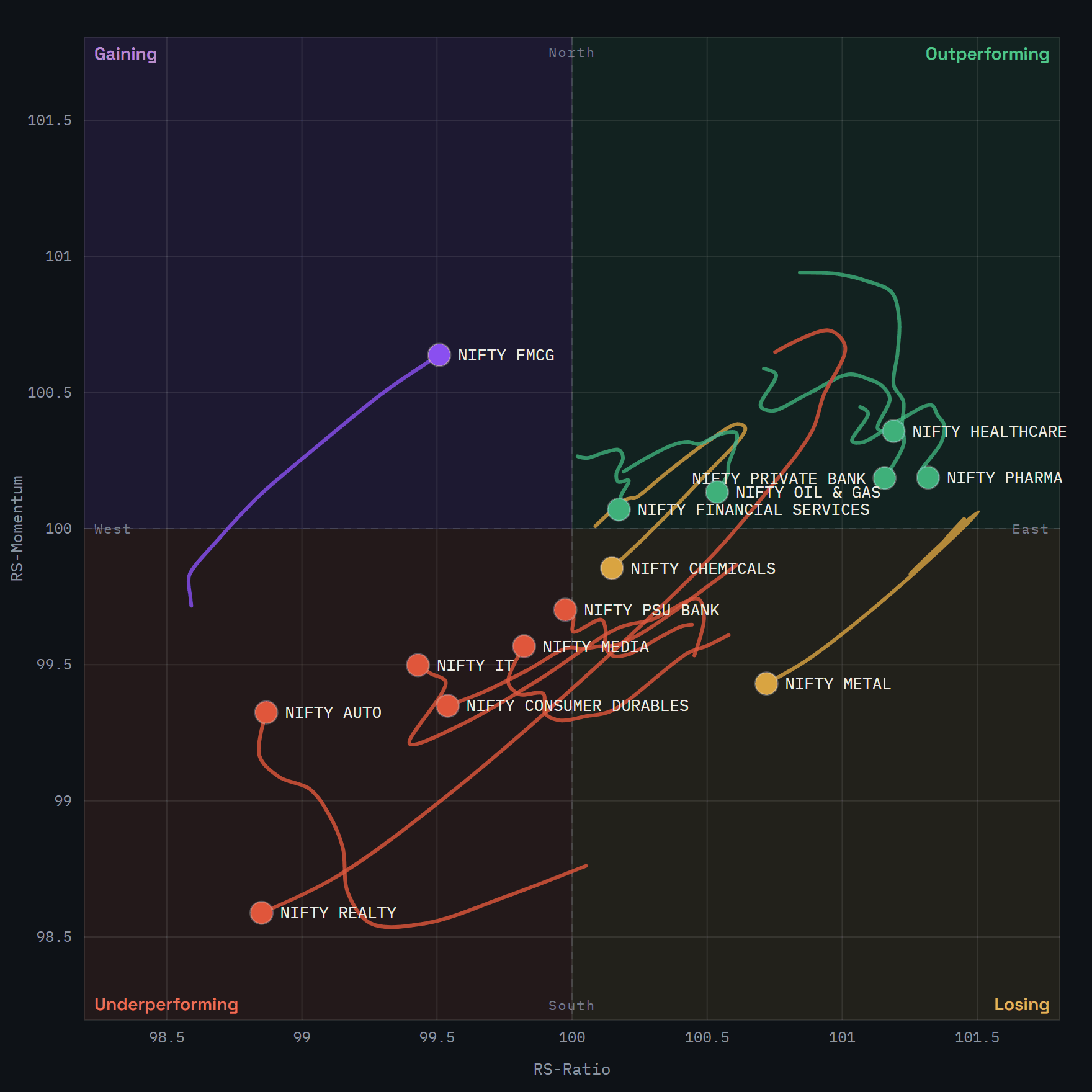
top-rightOutperforming
Ahead of the index and pulling further ahead.
bottom-rightLosing
Still ahead, but momentum has turned down.
bottom-leftUnderperforming
Behind the index and falling further behind.
top-leftGaining
Still behind, but momentum has turned up.
What it will do
- Sectoral indices, sub-sectors, stocks and futures against a benchmark of your choice
- Daily or weekly, with adjustable calculation and tail lengths
- An animated replay of the last few weeks of rotation
- A sortable table with ratio, momentum, direction and quadrant for every symbol
- Free for the sectoral indices; a Pro tier for the full universe and history
Want to read it before it opens? How to read the Relative Performance Rotation Graph walks through the two axes, the four quadrants and the tails.
Markets carry substantial risk of loss. This is a research tool, not investment advice.